
Sample article for website preview.
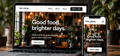
A business website should help visitors answer three questions: is this relevant to me, can I understand the offer, and what should I do next? Visual design supports those decisions. Before choosing another animation or adding another section, check whether the page makes the basics clear.
Give each page one main purpose
Decide what a useful next step looks like for the visitor. A service page may lead to a quote request, while an introductory article may lead to a related service. Choose a main action that matches the page. Secondary links can still be available, but they should not compete equally for attention.
Use button labels that explain the destination. “Request a quote” is clearer than a vague instruction when the next page is a quote form. Make sure the destination delivers what the button promises. A booking label should not unexpectedly open a general information page.
Explain the offer before asking for action
Lead with the service and the problem it helps address. Follow with practical details: what is included, who it suits, what the process involves and what information you need from the customer. Plain language helps people assess fit without decoding marketing terms.
Use evidence you can support. Real project examples, accurate service descriptions and permission-based customer feedback can help explain your work. Avoid invented results, unsupported guarantees or stock photographs presented as your actual team. If an image is illustrative, keep its context honest.
Review the mobile journey
Check the page on a narrow screen, not only in a desktop layout. Read the headings, follow the main button and inspect the contact area. Look for clipped text, small controls, overlapping sections and unnecessary horizontal scrolling. Make sure important content remains available when the layout changes.
Keep form requests proportionate to the enquiry. Ask only for information needed at this stage and explain optional fields. Give every field a visible label. If a form is only a demonstration, mark it clearly and disable submission rather than suggesting that a message was delivered.
Improve one thing at a time
Ask someone unfamiliar with the page to describe the offer and find the next step. Note where they hesitate without explaining the page for them. Their questions can reveal unclear wording or missing information.
Choose one change, document why you made it and review the outcome using your own enquiry data and feedback. Clearer design is an ongoing process. The aim is to make a useful action easier, without promising that one layout change will produce a particular result.